Pages

Sunday, 16 October 2016

Sara Fanelli - Collage using own images


Fanelli creates her creatures using collages made of many materials and contrasting images, making weird animals with unusual anatomy [1]. Using my sketchbook of drawings and Photoshop, I created some surreal creatures such as the three-headed deer from observational drawings of a ceramic figure in the Ashmolean Museum.

I also used an existing nonsense creature, a kind of bird thing, and overlaid some other museum drawings of roman coins and made it so the creature is looking into a Roman pot. By adding images with semiotic meaning, I have added more interest into the creature's design. This method of overlaying textures could be applied to create collaged work, such as Fanelli makes, but should be kept quite simple as the image may became too complicated and confusing.


Reference
[1] Fanelli 2002


Bibliography

Amazon. 2016. Mythological Monsters. [ONLINE] Available at: https://www.amazon.co.uk/d/Books/Mythological-Monsters-Sara-Fanelli/184428560X. [Accessed 9 December 2016].

Blogspot. 2014. The World of . . . Sara Fanelli. [ONLINE] Available at: http://rz100.blogspot.co.uk/2014/03/el-mundo-desara-fanelli-ii.html. [Accessed 9 December 2016].

Sara Fanelli - Found Collage


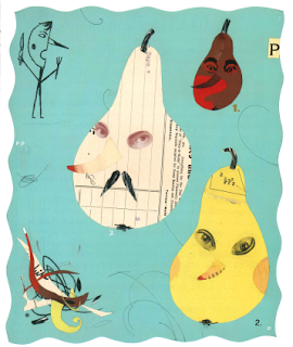
Sara Fanelli uses a mix of collage and simple ink drawings to create her illustrations which gives an often naive look that children can engage with easily. I looked at 'Pinnochio' [1], the traditional story which she illustrated recently, and took inspiration from her style of simple shapes to create my own creatures.


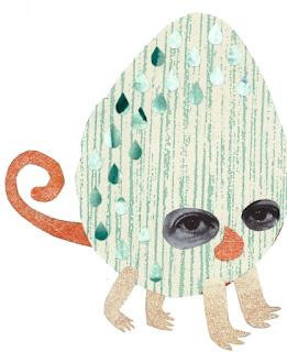
Task 1: Use Fanelli's technique of photographed and photocopied eyes to create a simple collaged image of a strange person or creature. You can include simple brush drawings in ink.

I dislike Fanelli's style and do not find it visually appealing because of its harsh shapes and irregular spacing. I do like the use of textures in children's books so I have used these in this task and made a few examples of creatures from printed paper and photocopied eye photographs. The shapes came quite organically from the half-cut, recycled paper which I found in the studio. From these I created much softer looking creatures with rounded features which contrasts to Fanelli's use of sharp shapes. When I was a child, I know I liked soft and round images which is what I have created here. These creatures seem far less threatening and more friendly.


References
[1] Fanelli 2001

Bibliography

Amazon. 2016. Pinocchio. [ONLINE] Available at: https://www.amazon.co.uk/d/Books/Pinocchio-Carlo-Collodi/0744586321. [Accessed 9 December 2016].

Sara Fanelli. 2016. Homepage. [ONLINE] Available at: http://www.sarafanelli.com/docs/portfolio/20.html. [Accessed 9 December 2016].

Chris Ware - Non-linear narrative

Ware often uses non-linear narrative to explain the hidden features of a character such as their thoughts or backstory. In this example of 'Quimby Mouse' [1], movement is shown through film-strip like frames that can be read in any order. Although this seems contrary to the nature of comics in general, it can be used to explain more about a character or environment.

A similar technique is used in the book 'Here' [2], which shows the same small area through many years, from early life to the 2010s and everywhere in between. It does not show it in sequence and also focuses on some years / scenes in particular.


I thought about the complexities of a tube train and how different the people are that use it every day. There is a teenager listening to music, on her way home from school and thinking about sleep and a businessman on his way home and the contents of both of their bags. There are also graphic elements in the adverts and maps shown inside. 


References
[1] Ware 1990
[2] McGuire 2014


Bibliography

Pinterest. 2016. Chris Ware Diagram. [ONLINE] Available at: https://nl.pinterest.com/pin/32158584809045142/. [Accessed 9 December 2016].

The Guardian. 2014. Here by Richard McGuire review – an exquisitely drawn ecological warning. [ONLINE] Available at: https://www.theguardian.com/books/2014/dec/21/here-richard-mcguire-review-exquisitely-drawn-ecological-warning. [Accessed 9 December 2016].

Wikipedia. 2016. Quimby the Mouse. [ONLINE] Available at: https://en.wikipedia.org/wiki/Quimby_the_Mouse. [Accessed 9 December 2016].

Chris Ware - Raccord


Chris Ware's work is very geometric and ordered, seen here in his raccord 'Big Tex' [1], a non-linear narrative about a tree and the events that happen around it over several decades. The passage of time is seen through the changing of seasons, shown through use of bright colour in spring and summer and pale, saturated colours in winter, as well as the featured characters growing from frame to frame and the inclusion of the gravestones of characters who were alive in previous panels.

This idea is also used by Frank King in his 'Gasoline Alley' comic in the 1930s [2]. He uses a single scene and follows the movements of the same characters from frame to frame. In this example, the narrative is much more linear and shows the progression of the beach-goer as he trips and fumbles his way across the sand and into the sea. 

Some key differences between the two are: King's scene occurs over a shorter time period than Ware's meaning a relationship to the character is more essential as he has less time to portray. The colours used also differ, especially as Ware is showing multiple seasons instead of one scene; I prefer the muted colours King uses here although from looking at Ware's other works, I know some of his preferred palettes are less garish and clashing.


The piece I created to show the raccord idea is a busy desk over the course of a few days. I wanted to show the presence of a person using the desk even though they were not seen directly. The idea of changing seasons and weather from Ware's piece was appealing so I included a little of this in the window, it goes from shuttered to raining to sunny and open. Also, in King's work some of the background elements stayed the same from panel to panel which I incorporated in the book shelf and flooring area, because these are not the center of interest it works quite well and keeps the viewer's attention on the table and window.


References
[1] Ware 1996
[2] Wikipedia 2016


Bibliography

Nicolas Verstappen. 2016. "Big Tex" by Chris Ware. [ONLINE] Available at: https://fromdusktilldrawnblog.wordpress.com/2016/05/05/big-tex-by-chris-ware-usa-1996/. [Accessed 7 December 2016].

Wikipedia. 2016. Gasoline Alley. [ONLINE] Available at: https://en.wikipedia.org/wiki/Gasoline_Alley. [Accessed 7 December 2016].