Ware often shows time passing slowly [1] by focusing on small background or scenery details such as the sky changing colour in the evening or the trees growing buds as it changes from winter to spring. In this example, the colours stay the same which helps to show the differences between the panels (movement of the bird and tree growth).
Having a pause from the narrative using this method gives the reader a moment to rest, especially after an exciting or eye-opening scene. It also helps to slow down the story and give a better pacing.
Showing the passage of time through plant growth gives an organic feel to the story even though it is set in an urban environment so I wanted to explore plant growth as well, in particular mushrooms because I find them weird and therefore interesting. For reference I watched some time lapse videos [2] of different fungi growing in a forest environment, the way the mushroom cap shoots up and then fans outwards was something I wanted show in my image and having a sequence was a suitable way to show this.
I kept the colour palette very simple, as Ware does, to better show the mushrooms and shoots as they are the focus of the scene. The browns give an earthy feel to the environment which works well without being unrealistic.
References
[1] Ware 2000
[2] Wonderful Life 2015
Bibliography
Read Comics. 2016. Jimmy Corrigan - The Smartest Kid on Earth. [ONLINE] Available at: http://www.readcomics.tv/jimmy-corrigan-the-smartest-kid-on-earth-2000/chapter-1/95. [Accessed 10 December 2016].
Ware, C, 2000. Jimmy Corrigan, the Smartest Kid on Earth. 1st ed. 37, 92, : Pantheon Books
YouTube, Wonderful Life. 2015. Mushroom Growing Time Lapse. [ONLINE] Available at: https://www.youtube.com/watch?v=2TZNEjXruy0. [Accessed 10 December 2016].
Showing posts with label Chris Ware. Show all posts
Saturday, 10 December 2016
Friday, 9 December 2016
Chris Ware - Colour
I looked at Ware's use of limited colour palette and chose this example called 'A Feeling' from 'Building Stories' [1] because it shows two palettes that change with the lighting in the environment. The warm browns he uses are interesting because they have purple in them too, giving a dull appearance. Having muted colours here reflects the narrative of the story as the character has an overwhelming feeling but as the viewer, having an external viewpoint, we do not see her mental anguish - only what she tells us.
Having two palettes works well here as it gives a clear indication of the character's movement from a dark bathroom to a lit bedroom and also provides a change of mood from a cold (blues) atmosphere to a more comfortable one (warm / neutral tones).
I used my raccord piece as a starting point to use colour on. Like Ware, I wanted to show a change in mood and atmosphere so I divided the image into day time with warm colours and evening with cooler blues and greys. I used the same colours as the 'A Feeling' comic, using the eyedropper tool to get precise tones and by doing this, has helped my understanding of Ware's use of colour.
Subtle purples add more depth to the browns which is very different to how I use colour and will be something I can experiment with in the future. I think having this purple that complements the blue in the other palette helps to keep the image cohesive and relates the two areas to each other rather than separating them.
References
[1] Ware 2012
Bibliography
Strudel: Chris Ware. 2016. Strudel: Chris Ware. [ONLINE] Available at: http://milhojasservicioseditoriales.blogspot.co.uk/2012/02/chris-ware.html. [Accessed 09 December 2016].
Wikipedia. 2016. Building Stories. [ONLINE] Available at: https://en.wikipedia.org/wiki/Building_Stories. [Accessed 9 December 2016].
Sunday, 16 October 2016
Chris Ware - Non-linear narrative
Ware often uses non-linear narrative to explain the hidden features of a character such as their thoughts or backstory. In this example of 'Quimby Mouse' [1], movement is shown through film-strip like frames that can be read in any order. Although this seems contrary to the nature of comics in general, it can be used to explain more about a character or environment.
A similar technique is used in the book 'Here' [2], which shows the same small area through many years, from early life to the 2010s and everywhere in between. It does not show it in sequence and also focuses on some years / scenes in particular.
I thought about the complexities of a tube train and how different the people are that use it every day. There is a teenager listening to music, on her way home from school and thinking about sleep and a businessman on his way home and the contents of both of their bags. There are also graphic elements in the adverts and maps shown inside.
References
[1] Ware 1990
[2] McGuire 2014
Bibliography
Pinterest. 2016. Chris Ware Diagram. [ONLINE] Available at: https://nl.pinterest.com/pin/32158584809045142/. [Accessed 9 December 2016].
The Guardian. 2014. Here by Richard McGuire review – an exquisitely drawn ecological warning. [ONLINE] Available at: https://www.theguardian.com/books/2014/dec/21/here-richard-mcguire-review-exquisitely-drawn-ecological-warning. [Accessed 9 December 2016].
Wikipedia. 2016. Quimby the Mouse. [ONLINE] Available at: https://en.wikipedia.org/wiki/Quimby_the_Mouse. [Accessed 9 December 2016].
Chris Ware - Raccord
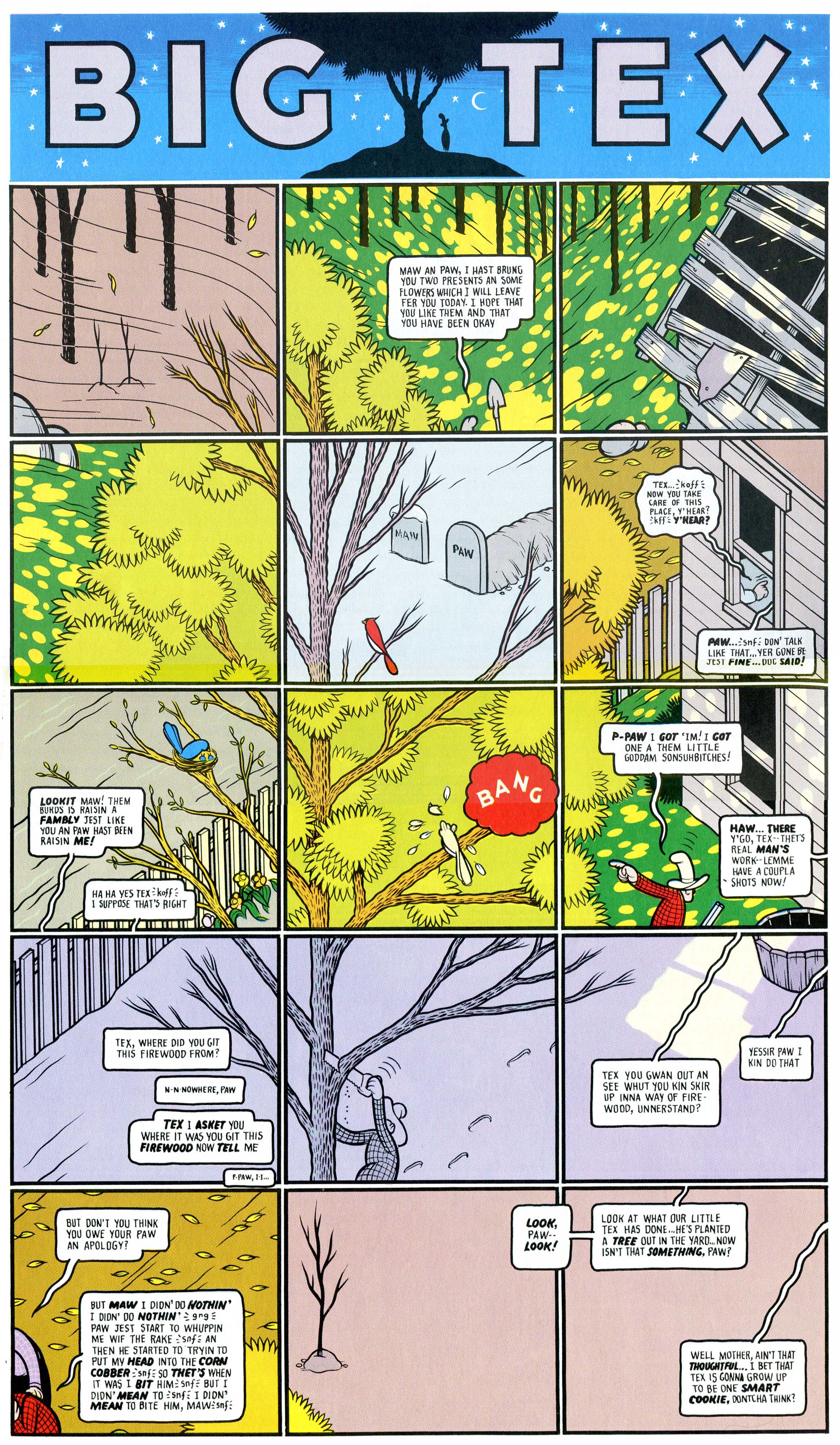
Chris Ware's work is very geometric and ordered, seen here in his raccord 'Big Tex' [1], a non-linear narrative about a tree and the events that happen around it over several decades. The passage of time is seen through the changing of seasons, shown through use of bright colour in spring and summer and pale, saturated colours in winter, as well as the featured characters growing from frame to frame and the inclusion of the gravestones of characters who were alive in previous panels.
This idea is also used by Frank King in his 'Gasoline Alley' comic in the 1930s [2]. He uses a single scene and follows the movements of the same characters from frame to frame. In this example, the narrative is much more linear and shows the progression of the beach-goer as he trips and fumbles his way across the sand and into the sea.
Some key differences between the two are: King's scene occurs over a shorter time period than Ware's meaning a relationship to the character is more essential as he has less time to portray. The colours used also differ, especially as Ware is showing multiple seasons instead of one scene; I prefer the muted colours King uses here although from looking at Ware's other works, I know some of his preferred palettes are less garish and clashing.
The piece I created to show the raccord idea is a busy desk over the course of a few days. I wanted to show the presence of a person using the desk even though they were not seen directly. The idea of changing seasons and weather from Ware's piece was appealing so I included a little of this in the window, it goes from shuttered to raining to sunny and open. Also, in King's work some of the background elements stayed the same from panel to panel which I incorporated in the book shelf and flooring area, because these are not the center of interest it works quite well and keeps the viewer's attention on the table and window.
References
[1] Ware 1996
[2] Wikipedia 2016
Bibliography
Nicolas Verstappen. 2016. "Big Tex" by Chris Ware. [ONLINE] Available at: https://fromdusktilldrawnblog.wordpress.com/2016/05/05/big-tex-by-chris-ware-usa-1996/. [Accessed 7 December 2016].
Wikipedia. 2016. Gasoline Alley. [ONLINE] Available at: https://en.wikipedia.org/wiki/Gasoline_Alley. [Accessed 7 December 2016].
Subscribe to:
Posts (Atom)