Pages

Saturday, 10 December 2016

Editorial - Using shapes


I looked at the art of Eric Fraser who makes very stark, graphic images in black and white [1]. His illustrations are unusual and distinctively styled, often looking like a wood-cut print more than a drawing. He makes use of bold shapes such as silhouettes of people [2] to create a strong composition. Because of this, we were all given a sheet of shapes and symbols often used in editorial illustration such as a silhouette head, a ladder, hourglass, arrow etc.


For my piece I decided to use the globe image and make it into a statement about Brexit which happened in the last few months. Having a political opinion in a cartoon is important as it gives a clearer message than an unbiased one.

I coloured the world in blue and green because, although unrealistic, they are the symbolic colours of the Earth and help us recognize it easily even if the geography is inaccurate. Then I cut around the UK which I had coloured red and drew in a 'cut here' line used in instructional diagrams which is also an easily recognized symbol. Red has the connotations of anger and danger, helping to communicate how I feel about the UK 'cutting' itself off from the EU. Using the scissor 'cut' line, it becomes a visual metaphor for 'cutting off' from the EU which I think works well for a very simple image.


References
[1] Fraser
[2] Fraser

Bibliography

Blogger, Phil Beard. 2007. Eric Fraser (1902-1983). [ONLINE] Available at: http://buttes-chaumont.blogspot.co.uk/2007/07/eric-fraser-1902-1983.html. [Accessed 10 December 2016].


Wikipedia. 2016. Eric Fraser (illustrator). [ONLINE] Available at: https://en.wikipedia.org/wiki/Eric_Fraser_(illustrator). [Accessed 10 December 2016].


Colour-Wheel-Pro. 2015. Colour Meaning. [ONLINE] Available at: http://www.color-wheel-pro.com/color-meaning.html. [Accessed 10 December 2016].

Chris Ware - Slow Time

Ware often shows time passing slowly [1] by focusing on small background or scenery details such as the sky changing colour in the evening or the trees growing buds as it changes from winter to spring. In this example, the colours stay the same which helps to show the differences between the panels (movement of the bird and tree growth).

Having a pause from the narrative using this method gives the reader a moment to rest, especially after an exciting or eye-opening scene. It also helps to slow down the story and give a better pacing.


Showing the passage of time through plant growth gives an organic feel to the story even though it is set in an urban environment so I wanted to explore plant growth as well, in particular mushrooms because I find them weird and therefore interesting. For reference I watched some time lapse videos [2] of different fungi growing in a forest environment, the way the mushroom cap shoots up and then fans outwards was something I wanted show in my image and having a sequence was a suitable way to show this.

I kept the colour palette very simple, as Ware does, to better show the mushrooms and shoots as they are the focus of the scene. The browns give an earthy feel to the environment which works well without being unrealistic.


References
[1] Ware 2000
[2] Wonderful Life 2015

Bibliography

Read Comics. 2016. Jimmy Corrigan - The Smartest Kid on Earth. [ONLINE] Available at: http://www.readcomics.tv/jimmy-corrigan-the-smartest-kid-on-earth-2000/chapter-1/95. [Accessed 10 December 2016].

Ware, C, 2000. Jimmy Corrigan, the Smartest Kid on Earth. 1st ed. 37, 92, : Pantheon Books

YouTube, Wonderful Life. 2015. Mushroom Growing Time Lapse. [ONLINE] Available at: https://www.youtube.com/watch?v=2TZNEjXruy0. [Accessed 10 December 2016].


Friday, 9 December 2016

Editorial - .gif

GIFs are now being used in modern publications online [1] as they take advantage of the digital nature of an article and creates more interest than a plain illustration. Inspired by the animated GIFs of Rebecca Mock [2] [3], I attempted to make my own using one of my existing images. Especially with Mock's animations, I like how she keeps the image very still an only has a few moving components as it gives a sense of calm. From looking at her animations involving technology such as a phone notification [4], I would like to make an animation involving technology that moves in a small way.


I used my existing tv-head character and coloured it using Photoshop, adding some simple cel-shading to show shape. Using the frame animation feature, I made it so that an 'x' would appear on his screen face. By doing this, it adds more interest and shows that the muting is an ongoing action because of the repeating nature of the GIF.  I am very pleased with my result, even though it is no where as complicated or realistically shown as Mock's works, it communicates the article I chose well.


References
[1] Schuessler 2016
[2] Mock 2016
[3] Mock 2014
[4] Mock 2012


Bibliography

New York Times. 2016. The Federal Government's Latest Project: Squirrel GIFs - New York Times. [ONLINE] Available at: http://www.nytimes.com/2016/10/19/arts/design/watch-gifs-bring-history-to-life-patriotic-squirrel-included.html?_r=0. [Accessed 6 November 2016].

Nice Fucking Graphics!. 2014. Ilustraciones animadas de Rebecca Mock. [ONLINE] Available at: http://nfgraphics.com/ilustraciones-animadas-rebecca-mock/. [Accessed 9 December 2016].

Tumblr. 2016. Anhedonia, Here I Come. [ONLINE] Available at: http://rebeccamock.tumblr.com/image/142690983743. [Accessed 9 December 2016].


Tumblr. 2012. Party (gif version). [ONLINE] Available at: http://rebeccamock.tumblr.com/post/24100369111/party-gif-version-original-x. [Accessed 9 December 2016].

Wired. 2013. 10 Awesomely Tasteful Animated GIFs. [ONLINE] Available at: https://www.wired.com/2013/09/the-rise-of-subtle-tasteful-and-commissioned-animated-gif-illustrations/. [Accessed 9 December 2016].

Chris Ware - Colour


I looked at Ware's use of limited colour palette and chose this example called 'A Feeling' from 'Building Stories' [1] because it shows two palettes that change with the lighting in the environment. The warm browns he uses are interesting because they have purple in them too, giving a dull appearance. Having muted colours here reflects the narrative of the story as the character has an overwhelming feeling but as the viewer, having an external viewpoint, we do not see her mental anguish - only what she tells us.

Having two palettes works well here as it gives a clear indication of the character's movement from a dark bathroom to a lit bedroom and also provides a change of mood from a cold (blues) atmosphere to a more comfortable one (warm / neutral tones).

I used my raccord piece as a starting point to use colour on. Like Ware, I wanted to show a change in mood and atmosphere so I divided the image into day time with warm colours and evening with cooler blues and greys. I used the same colours as the 'A Feeling' comic, using the eyedropper tool to get precise tones and by doing this, has helped my understanding of Ware's use of colour.

Subtle purples add more depth to the browns which is very different to how I use colour and will be something I can experiment with in the future. I think having this purple that complements the blue in the other palette helps to keep the image cohesive and relates the two areas to each other rather than separating them.


References
[1] Ware 2012


Bibliography

Strudel: Chris Ware. 2016. Strudel: Chris Ware. [ONLINE] Available at: http://milhojasservicioseditoriales.blogspot.co.uk/2012/02/chris-ware.html. [Accessed 09 December 2016].

Wikipedia. 2016. Building Stories. [ONLINE] Available at: https://en.wikipedia.org/wiki/Building_Stories. [Accessed 9 December 2016].

Saturday, 3 December 2016

Concept Art - Character Design

I began with my character description from the 'Dungeons and Dragons' game [1] with additional information that I had decided on previously (such as their backstory and individual appearance). My design needed to include: half-elf appearance, piratical themes, roguish clothing and some weapons (a rapier or daggers)

Inspiration came from recent playing of the video game 'Dishonored' [2] (a game in which you play as an assassin in a fictional city) which the character designer, Cedric Peyravernay, and art director, Victor Antenov, based on steampunk and neo-victorian ideas [3] [4]. In particular, I like the military style of the clothes [5] so I used these in some of my designs.

The initial sketches I made were to establish their facial appearance and some ideas on how the clothing might look. I also researched some images of rapiers [6] to better understand how to draw them.

I am pleased with my attempt especially my use of colour as I tried to give each different design a unique colour scheme, Design 1 has the initial piratical look from the loose shirt and wide belt which give a co-ordinated look. Options 2 and 3 are most inspired by the 'Dishonored' game art, using more Victorian clothing shapes and the darker colours worn by an assassin. Options 4 and 5 look more like the traditional style of the 'Dungeons and Dragons' characters [7], a more middle-aged look that fits in better with the game's themes.


By exploring several different style options, I now have a better idea of how my character should look and the practicality of different clothing ideas. However, I want to pursue both Options 1 and 3 so it will be a difficult decision!


References
[1] Gygax and Arneson 1974
[2] Bethesda 2012
[3] Peyravernay 2016
[4] Antenov 2012
[5] Peyravernay 2014
[6] Pinterest 2016
[7] Hasbro 2016


Bibliography
ArtStation. 2016. ArtStation - Cedric Peyravernay. [ONLINE] Available at: https://www.artstation.com/artist/cedricpeyravernay. [Accessed 03 December 2016].

ArtStation. 2016. ArtStation - Dishonored-Elite Research, Cedric Peyravernay. [ONLINE] Available at: https://www.artstation.com/artwork/9NzlO. [Accessed 03 December 2016].

Classes | Dungeons & Dragons. 2016. Classes | Dungeons & Dragons. [ONLINE] Available at: http://dnd.wizards.com/dungeons-and-dragons/what-is-dd/classes. [Accessed 03 December 2016].

Dishonored Characters Art - Pictures - Game Pics - Images. 2016. Dishonored Characters Art - Pictures - Game Pics - Images. [ONLINE] Available at: http://www.creativeuncut.com/art_dishonored_a.html. [Accessed 03 December 2016].

Pinterest. 2016. 1000+ images about d&d insp on Pinterest | LARP, Costume and Swords. [ONLINE] Available at: https://uk.pinterest.com/tocsidiser/dd-insp/. [Accessed 03 December 2016].

Wikipedia. 2016. Half-elf (Dungeons & Dragons) - Wikipedia. [ONLINE] Available at: https://en.wikipedia.org/wiki/Half-elf_(Dungeons_%26_Dragons). [Accessed 03 December 2016].

YouTube. 2016. The Art of Dishonored - YouTube. [ONLINE] Available at: https://www.youtube.com/watch?v=qtLfj6lQeJE. [Accessed 03 December 2016].

Sunday, 27 November 2016

Concept Art - Digital painting

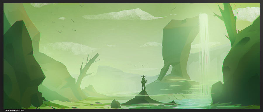
After watching speedpaints of concept landscapes on youtube, I wanted to try it myself (although my skills in Photoshop are quite limited) so I looked for an artist who makes more simple paintings. I found Badr Douah, a Moroccan artist who paints with bright colours and likes to experiment with shapes. [1] [2]


Taking inspiration from him, I chose a painting I had made previously and used it as a starting point for a digital painting.


I liked the primary colours I used in this piece and the unnatural landscape but wanted to give it more depth (as I had seen in the speedpaints [3] which depict a scene in a very 3-D way, suitable for a film or game). Elements I wanted to keep were the colours, the rider (a human figure is often used to show scale), and the shape of the rocks.


(screenshot of work) I altered the colours of the rocks as they went into the distance to give depth and used a more interesting angle which shows the shadows of the rocks and rider clearly.


(finished image) I am pleased with my image and found it useful for learning techniques used in digital painting, it is a vast improvement in my attempts from last year. The colours are much richer when working digitally compared to the original watercolour and pencil drawing, it makes it much easier to show depth and shadows.


References

[1] Douah 2015
[2] Douah 2012
[3] Molnar 2012


Bibliography

badr douah blog: ios android game art . 2016. badr douah blog: ios android game art . [ONLINE] Available at: http://douahbadr.blogspot.co.uk/2015/05/ios-android-game-art.html. [Accessed 27 November 2016].

DeviantArt. 2016. landscape concept by cstlmode on DeviantArt. [ONLINE] Available at: http://cstlmode.deviantart.com/art/landscape-concept-311461950. [Accessed 27 November 2016].

YouTube. 2016. Desert Base - Concept Art Speedpainting - YouTube. [ONLINE] Available at: https://www.youtube.com/watch?v=VzmFFzXneK0. [Accessed 27 November 2016].

Sunday, 6 November 2016

Editorial - Illustrating for an article


Aude van Ryn [1] creates images which are a mix of collage and painting and often display an abstract environment which incorporates realistic elements too. She uses texture in an understated way which is effective. I particularly like her use of flowing lines and variety of characters. 

We learned about common symbols used in editorial illustration such as handshakes, ladders, puppetry and office buildings, which are all present in van Ryn's work and are often the prominent feature.

Task: Using the given article, create a simple illustration to accompany it.

This was the article I chose (of the three): 'I Lost my Voice for Three and a half Years' [2] and from looking at the common symbol of replacing the figure's head with an object. I chose a tv because we associate it with a constant noise, and then I added the 'mute' symbol to show that this ability has been removed. Also the pose (sat and hunched over) shows a sadness that he cannot communicate with others, which was talked about in the article.


References
[1] van Ryn 
[2] Neff 2015


Bibliography

Heart Artist’s Agents - Artists - Aude Van Ryn - Galleries - Aude Van Ryn 1 . 2016. Heart Artist’s Agents - Artists - Aude Van Ryn - Galleries - Aude Van Ryn 1 . [ONLINE] Available at: http://www.heartagency.com/artist/AudeVanRyn/gallery/1/image/3538. [Accessed 6 November 2016].

The Guardian. 2016. Experience: I lost my voice for three and a half years | Life and style | The Guardian. [ONLINE] Available at: https://www.theguardian.com/lifeandstyle/2015/nov/27/experience-i-lost-my-voice-for-three-and-a-half-years. [Accessed 6 November 2016].